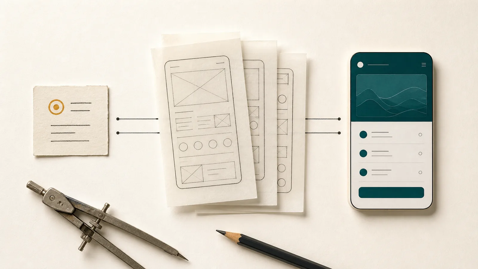

A new feature is easy to put on a roadmap. The menus, data fields, error states and support cases that come with it are much less visible. Software therefore often grows from a plausible but incomplete assumption: if an app can do more, it must be more valuable.
In practice, what matters is whether someone can complete the core task quickly, clearly and reliably. Product focus does not reject ideas or keep an app artificially small. It weighs every extension against a concrete benefit and against the long-term work that begins behind the visible interface.
At a glance
- Judge features by the user task they complete, not by their number.
- Every addition brings data, states, tests and long-term support work.
- Clear, honestly explained boundaries strengthen usability and maintainability.
Quality shows in the completed task
People rarely download an app because it has a certain number of features. They want to show a ticket, record an expense, find a document, schedule an appointment or look up information. From a product perspective, the feature list is therefore less important than a complete path to a meaningful result.
Take a simple reminder app. For its core purpose, a clear title, a due date, a status and a reliable notification are sufficient. A priority matrix, team roles, chat, time tracking and automatic text suggestions can be useful—but only for different or expanded tasks. If they are added without a clear usage scenario, they compete with the app’s actual purpose in the same interface.
A focused product therefore starts with three questions: Who is using it? In what situation? Which result should be better than before? “For anyone who wants to be more productive” answers none of these questions. “Private owners want to document a meter reading with a date and photo while away from home,” by contrast, describes a verifiable task.
Each function extends the entire system
A new button is rarely only a new button. Behind it are data, states, permissions and dependencies. An export feature requires, for example, a selection, a file format, error handling, storage or sharing dialogs, data protection decisions and tests on several operating-system versions. It must accommodate later changes to the data model and be described clearly in the help.
Accounts and synchronization are similar. The visible login is only the beginning. The product also needs identity management, account recovery, conflict resolution, server operation, security measures, deletion processes and support for lost access. All this can be necessary for a collaborative product. For a personal tool without cross-device use, the same architecture might create a heavy burden without corresponding benefits.
The Android App Architecture Guide recommends clear responsibility boundaries, a single source of truth and the lowest practical coupling. Such principles aim at maintainability, but at the same time show a product truth: the more interdependent capabilities a system contains, the more relationships people must understand and maintain permanently.
Clarity also comes from what you leave out
An understandable interface gives people clues without having to think about how to operate it. Visual hierarchy, consistency and familiar platform patterns help. Apple’s Human Interface Guidelines emphasize precisely these aspects. They are easier to implement when a view has a recognizable task.
Feature overload often does not appear as obvious chaos. It starts with small decisions: another icon in the navigation bar, another filter behind a menu, another status in a list. Each addition can look reasonable on its own. Together, however, they increase the number of decisions that people must make before the intended action.
This effect is particularly evident on a smartphone. Space is limited, use is often interrupted and attention is often divided. Anyone standing in front of a meter or looking for booking information at a door needs a dependable workflow, not a demonstration of the entire product. A good mobile interface therefore prioritizes the next meaningful step and moves rarely needed options out of the way without hiding them.
A narrower scope does not eliminate errors—but it enables focus
A small application is not reliable by itself. Even a single feature can be poorly designed or insufficiently tested. However, a limited range of features creates better conditions for treating the important cases thoroughly.
A complete process includes more than the ideal start and a successful end. What happens if permission is denied? Are entries retained when someone cancels? Is a result still available after a restart? Can an incorrect entry be corrected? What does the person see in an empty list? How does the app behave with larger text or without a network connection?
These questions take time. When a team spreads the same amount of time across more and more features, it cannot examine each workflow as deeply. Focus is therefore also a decision about the quality budget: which few workflows deserve especially careful error handling, useful feedback and tests with realistic data?
Product boundaries must be clear
A limit only helps if it does not seem like a hidden deficiency. A personal tool should clearly state if it does not support team collaboration. An offline app should explain how backups and device changes work. A document repository must not create the impression of an audit-proof archive. Honest boundaries protect against false expectations and more effectively reach the people whose situation truly fits.
“This function is missing” sounds like an incomplete list. “The app is designed for a single person on a device” describes a product decision and its consequence. The limit remains the same, but it becomes understandable through the usage scenario.
A good scope must also remain coherent. Not every conceivable feature must be included, but existing data should work together meaningfully within the intended product. A task feature is more helpful when it knows what the task relates to. A document becomes more useful through its assignment. Focus therefore does not mean building isolated miniatures, but building a small yet complete system.
When expanding the product really makes sense
Not every new idea creates feature overload. Products need to learn and develop. Clear criteria help make an extension verifiable:
- It solves a recurring problem of the clearly named target group.
- It strengthens an existing core process, rather than opening an independent product branch.
- Its success can be described as a better result, not merely as use of the new button.
- Data requirements, permissions and failure behavior are reasonable.
- The feature can be implemented accessibly and understandably on the relevant devices.
- Development, testing, operation and subsequent changes are sustainable.
The question of what happens without the extension is particularly relevant. Do people currently need to improvise a core step outside the app? Then there may be a gap. If the new feature merely adds convenience while the core workflow already works end to end, it should be weighed against other quality improvements.
An ideas backlog is often better than an automatic yes or no. It allows teams to collect observations, merge similar needs and first understand the underlying reason. A request for “more filters” may really point to poor naming, while “model-assisted search” may simply reflect the need for a well-structured local full-text search.
Focus is not a one-time MVP decision
A so-called Minimum Viable Product is sometimes misunderstood as the smallest possible first version, which inevitably grows into a comprehensive system later on. Product focus is a long-term discipline. An established tool should also be reviewed regularly to determine whether its features contribute to its purpose.
This can mean unifying rarely used variants, removing unclear settings or discontinuing a complex integration. Such decisions require robust observations and respectful handling of existing users. They are more difficult than adding another card to the roadmap, but can significantly improve the product.
Maintainability plays a central role here. Clear modules and responsibilities facilitate tests and changes. Even more important is a clear domain structure: terms should be consistent, data should not be maintained inconsistently in several places and workflows should not depend on random side effects. Technical architecture cannot save an unclear product scope, but it can make a clear scope sustainable.
Accessibility benefits from early decisions
Accessibility is a good example of why quality should not be treated as a later add-on. W3C WAI recommends including accessibility early and repeatedly in planning, implementation and evaluation. Sufficient contrast, understandable terms, larger text, and keyboard or screen reader use affect the basic shape of a product.
In an overloaded interface, these requirements become more expensive. More interactions mean more focus orders, labels, states and combinations that need to be tested. A clear structure does not make a product accessible automatically, but creates space to treat it as part of each core sequence.
The same applies to data protection and security. If a feature is considered only at the interface level, necessary permissions, data flows or deletion rules emerge late. Considering it as a complete product decision can show that a simpler conventional solution provides the same benefits with fewer risks.
A good feature list has clear reasons
There is no ideal number of features. What matters is whether each element has a clear role and whether the overall product remains understandable, testable and supportable. Growth becomes progress only when it genuinely strengthens the core task.
A good app does not need to do everything. It needs to show what it is for, support the appropriate path completely and be honest about its boundaries. That clarity often contributes more to product quality than the longest comparison table.
Sources and further reading
- Apple Human Interface Guidelines – principles for hierarchy, consistency and platform-appropriate design.
- Android Developers: Guide to app architecture – responsibility boundaries, data models, testability and maintainability.
- W3C WAI: Planning and Managing Web Accessibility – accessibility as an ongoing part of product work.